
At Paris Déco Off 2026, we had the pleasure of attending a beautiful fabric launch from one of my favorite lines, known for its outstanding quality and materials.
Trend Report: Paris Déco Off 2026
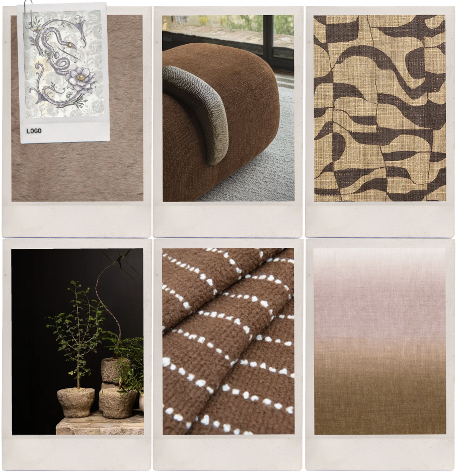
Brown Takes the Lead
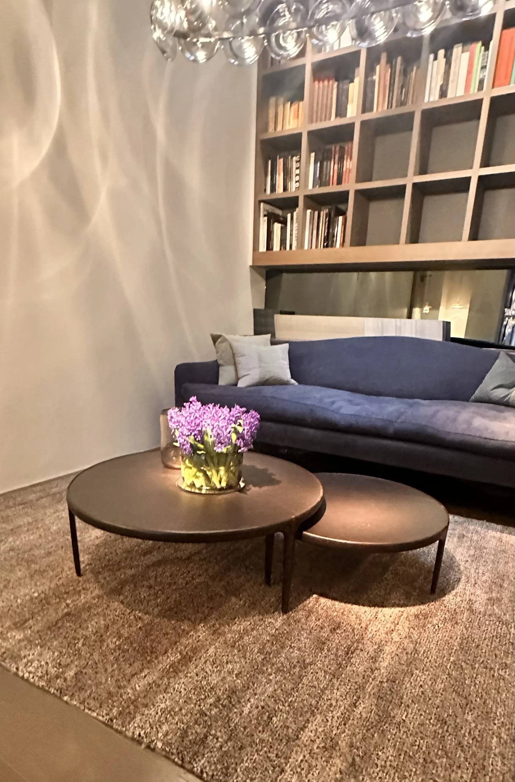
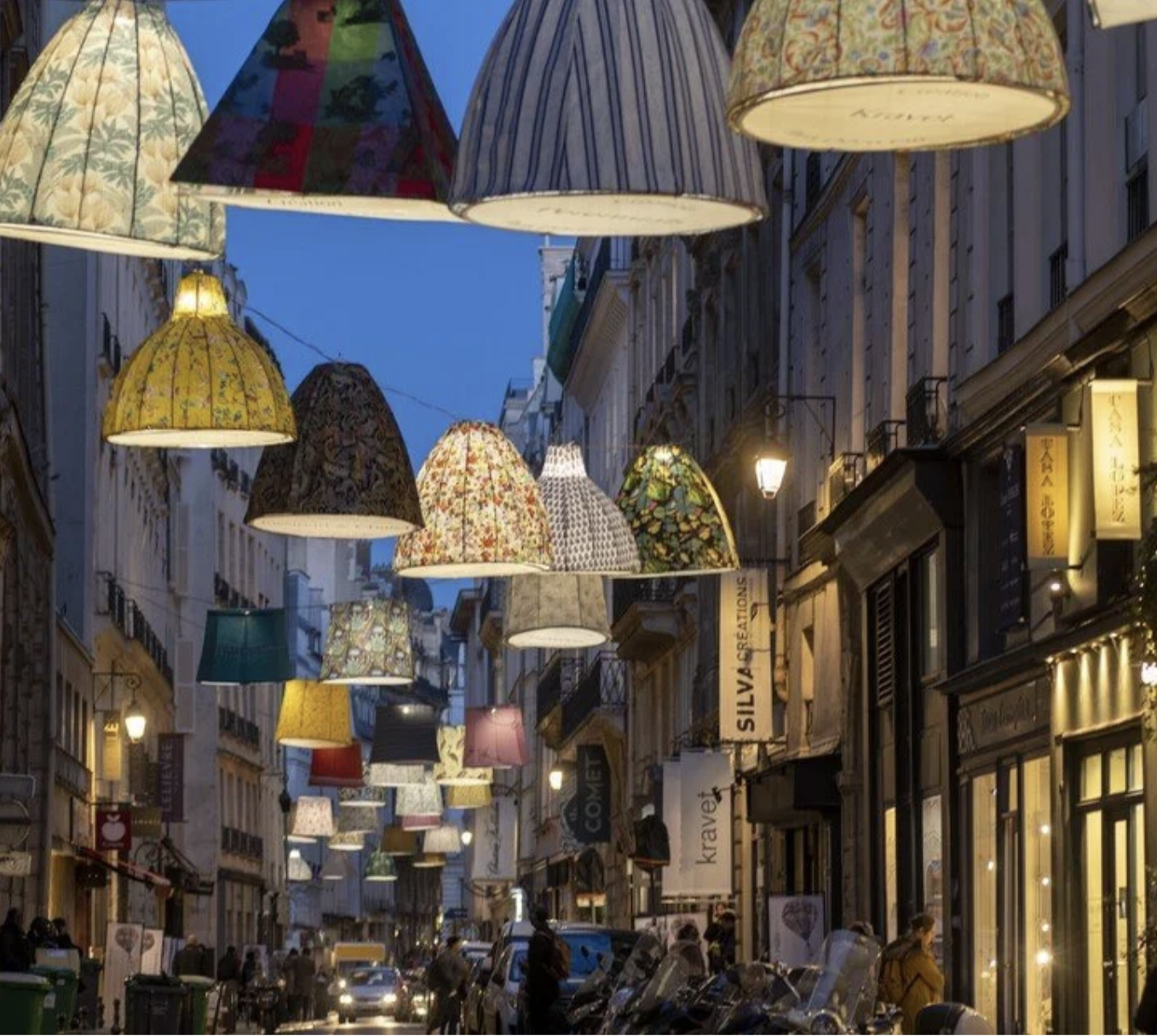
We had a blast scouring Paris Déco Off 2026. There were countless highlights—but one major takeaway stood out above the rest: the new it color is brown. (Yes, brown is the new neutral—not tan, beige, or gray. Thank god.)This year’s fabric launches felt warm, grounded, and incredibly inviting. Mineral tones and rich browns were everywhere, layered from soft sand and warm stone to deep, earthy umbers—bringing depth, richness, and effortless sophistication. Brown has officially stepped in as the neutral of the moment, and it’s a welcome shift toward something more soulful, dimensional, and enduring.
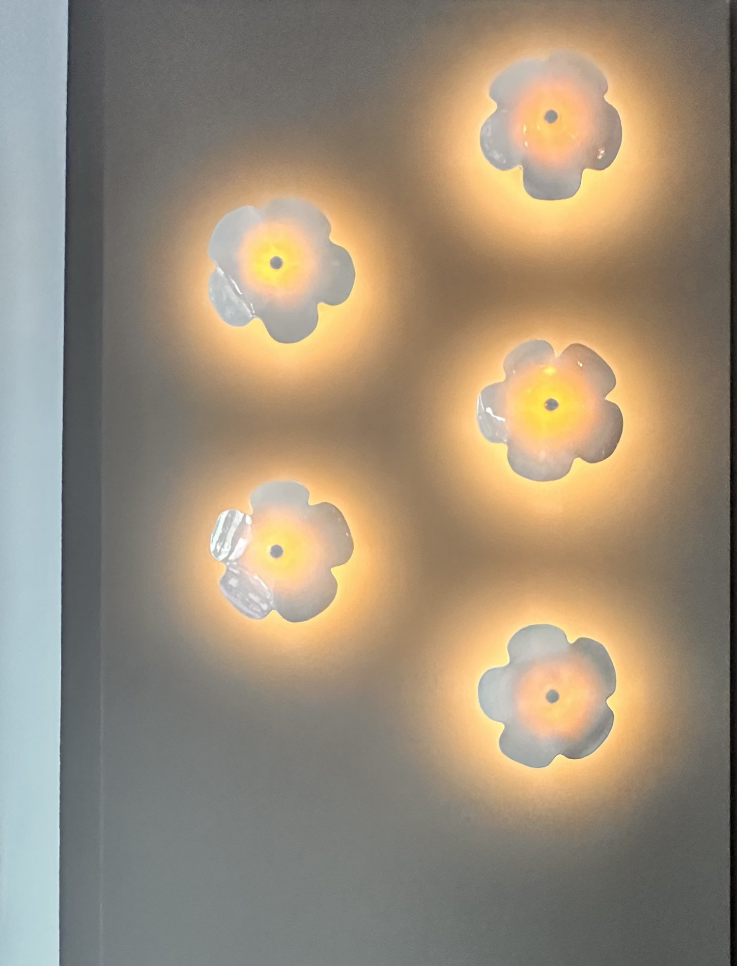
In contrast to this grounded foundation, we saw an exciting wave of bright patterns and unexpected color combinations that completely reenergized how a room can be styled. Bold, textured wallpapers, playful lighting, and sculptural brown leather pieces created interiors that felt layered, expressive, and full of personality. The mix of earthy neutrals and vibrant accents struck a beautiful balance—refined, but never predictable.
We also loved seeing heritage and abstract patterns —such as geometrics and stripes — reimagined with a modern point of view: familiar motifs with renewed energy and relevance. Across many collections, there was also a continued commitment to natural fibers and transparent sourcing, reinforcing a broader move toward authenticity and thoughtful design.
Paris made one thing clear: warmth is back, and brown is leading the way.
Studio Stellavato
color trends for 2026Let's start at the top — what's the overarching color mood you're tracking for 2026?We're seeing a real pull toward warmth that doesn't feel heavy. Not the stark minimalism of the past few years, and not the overly saturated maximalism that followed it. Instead, the palette is earthy, considered, and layered — colors that feel like they were found rather than chosen. The combinations we're excited about this year all live somewhere between grounding and uplifting.
Tell us about your first combination: carmel and light pink. Where does that come from?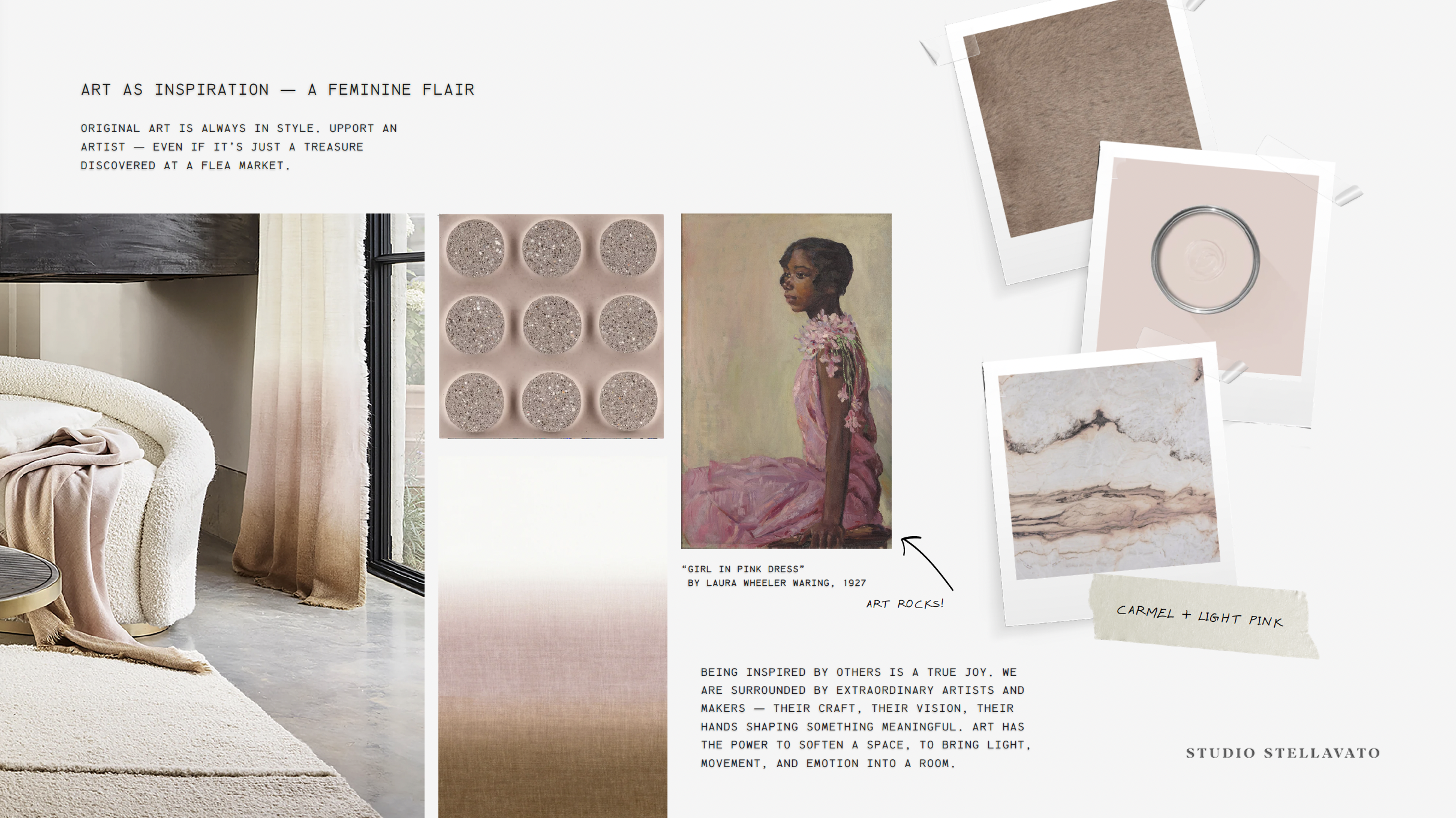
Carmel is such a quietly confident neutral — it carries warmth without being brown, and depth without being dark. Paired with a very soft, barely-there pink, the two tones just breathe together. It's a combination that works in textiles, especially: imagine a camel-toned bouclé alongside a blush linen. Understated, but unmistakably considered. We think of it as the "no-effort luxury" palette for 2026.
Honey brown and green feels a bit more unexpected. What drew you to that pairing?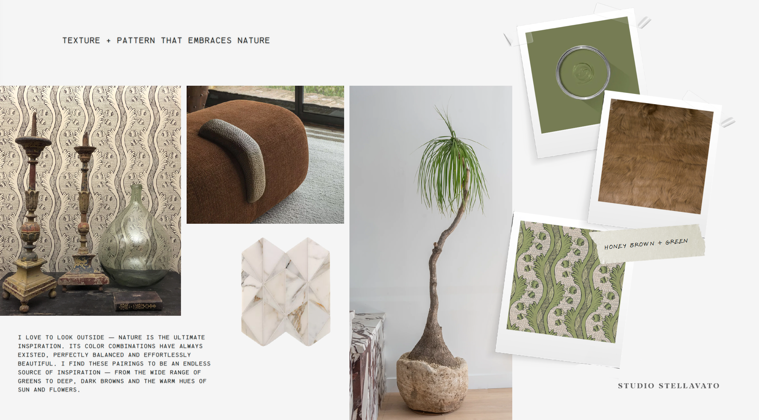
It's nature's own palette, honestly. Think of dried grasses against moss, or a warm wood floor in a room with aged sage walls. Honey brown — that golden, almost amber-tinged tan — brings life and richness, while a muted olive green keeps it from feeling too sweet. The pairing has a tactile quality to it. It wants to be touched: velvet, raw linen, brushed leather. For 2026 interiors, this is the combo we keep returning to when a client wants something both warm and grounded.
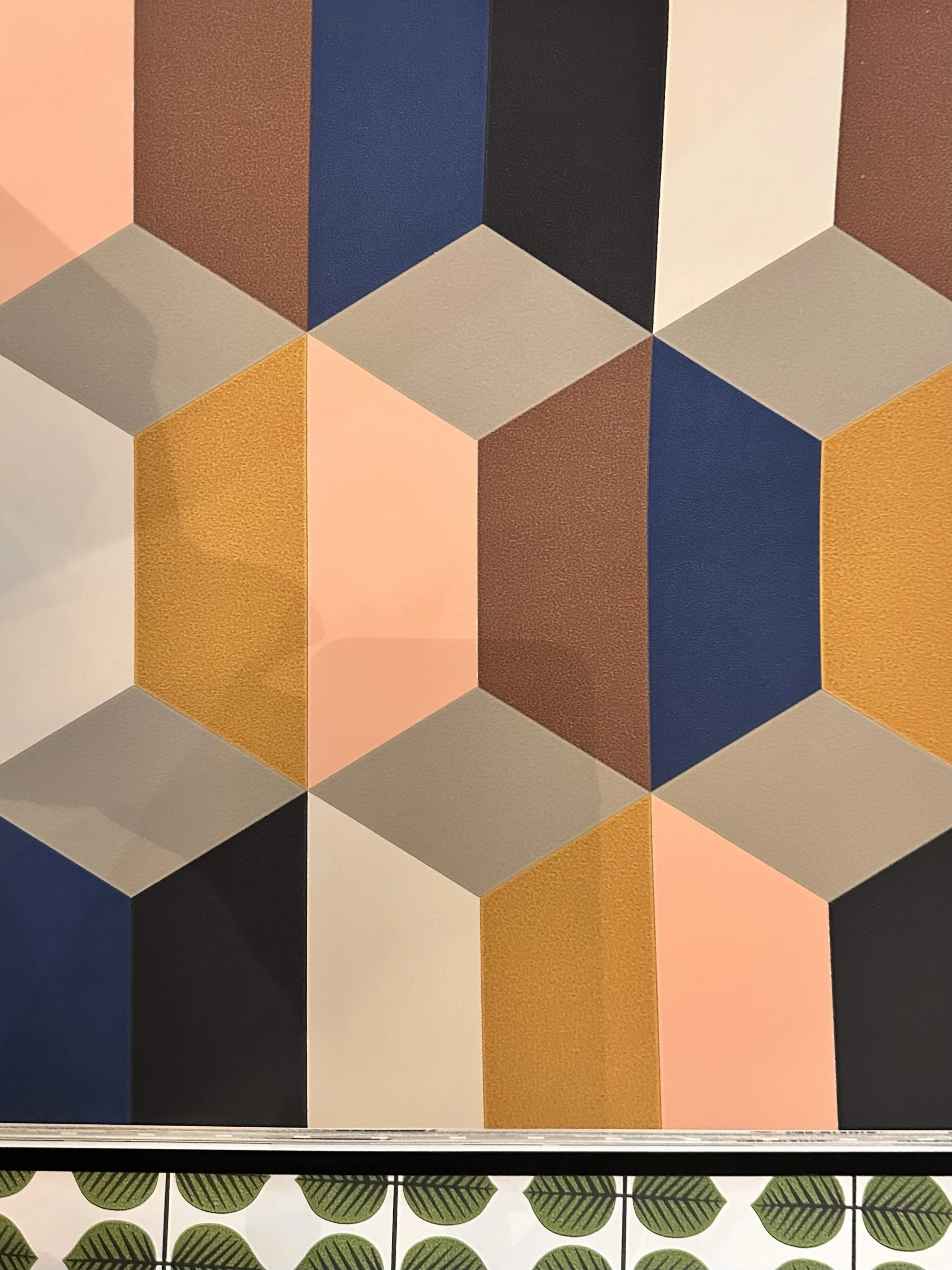
The third pairing is the most daring — chocolate brown with either a bright blue or a muted lavender. Why two options for one anchor color?
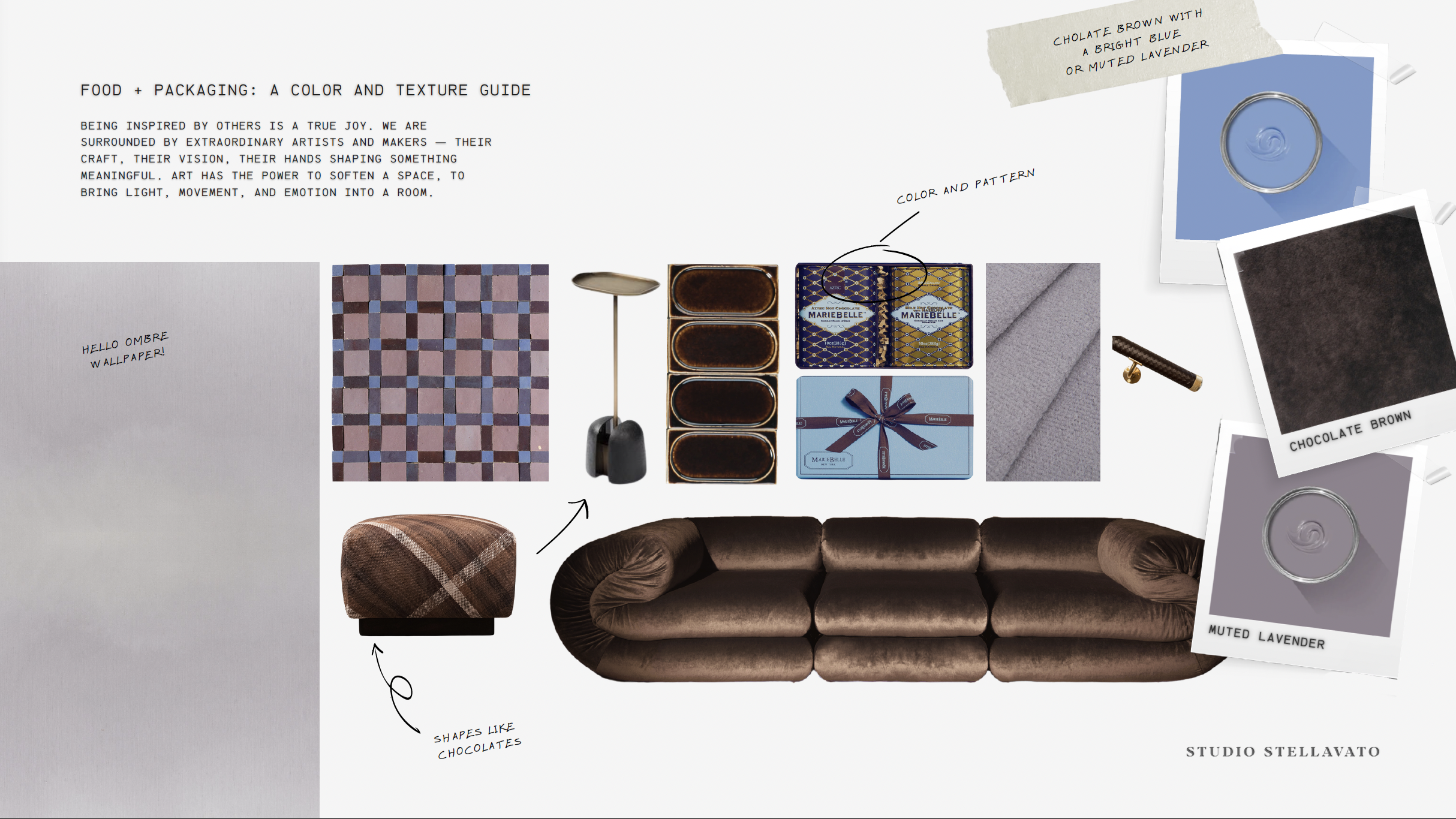
Because chocolate brown is a genuinely versatile anchor, and the secondary color completely changes the story it tells. With a bright blue — a true, almost cornflower blue — you get something bold and a little retro. It has energy and contrast, the kind of combination you notice immediately. With a muted lavender, the same dark brown becomes mysterious and romantic, almost moody. We love offering this as a "choose your own adventure" combination: same foundation, two entirely different personalities.
Color Combos That Excite Us
We sat down with our studio to ask the questions behind the palette — what we're seeing, why these combinations feel right for 2026, and how to use them.